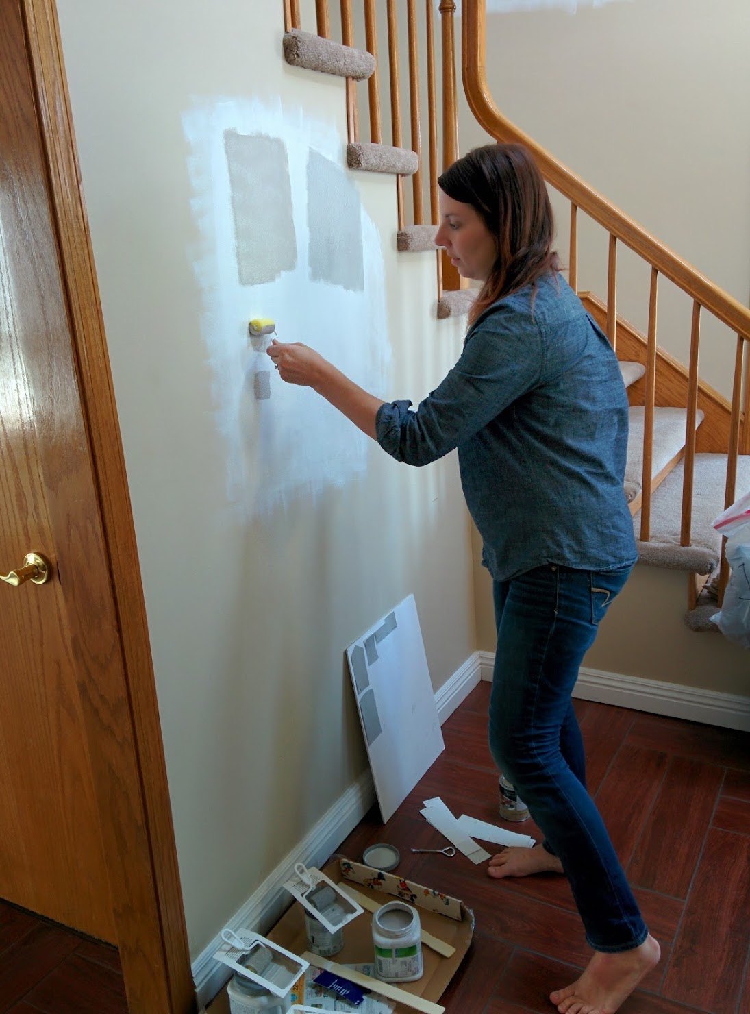
I selected five different walls to paint swatches on. I painted the background white, because I didn't want to be influenced by the warmer tan on the walls already. Was that smart? I DO NOT KNOW YET. Check back next month when I finally have paint on the walls. I'll keep you updated. You'll see why I'm not sure whether the white background was wise later.
Painting the swatches in those sample colors changed everything. I was no longer sure at all. Requisite Gray was more straight-up brown, Nightingale had a purple twinge, Metropolitan had a little blue twinge and was a little dark, and Smoke Embers had kind of a dull, putty-like look to it (like unbaked pottery). I didn't really love any of them.
Here are the colors at night, so with a warm cast (same order in all pics):
Top: SW Requisite Gray SW 7023, SW Essential Gray SW 6002
Bottom: BM Nightingale AF-670, BM Smoke Embers AC-28
Note: This is in the evening, with the only lights being interior lights, so it's slightly warmer here than it is in the daytime.
Literally after I finished painting them, I was like, "whomp whomp." While the chips looked all. so. similar. on the whiteboard, once the samples were on the wall they looked very different. Chris had previously just told me, "It doesn't matter - just pick one! They're all the same!" after seeing the chips, but had very strong opinions about them once they were up on the wall. I thought maybe the paint itself was actually off a little or a different color, but I held the chips up to the swatches, and they matched perfectly. It's just that hard to tell the true color from a tiny paint chip.
Bummer.
So I grabbed my bag of discarded paint swatches and pulled out a few more that looked promising. I added BM Revere Pewter (since everyone recommends that color, not just all over the internet, but my real-life friends as well - like so popular that the paint store said they have trouble keeping the paint chips for that strip in stock!), BM Gray Owl, BM Metropolitan, and BM Harbor Gray. I honestly was kind of discouraged (after just four colors? I don't have a career as a DIYer ahead of me....) and I wasn't sure how to use chips to choose a color if they were so different from paint chip to wall. Was I just going to have to get samples of everything??
(The blurry pics are from a phone with a broken camera, so sorry about that!)
The original four colors, plus the four new ones. You can really see the differences in color caused between daylight and artificial light in the colors here.
On the "Which color do I choose?" pic, they are:
Top: Top: SW Requisite Gray SW 7023, SW Essential Gray SW 6002
2nd Row: BM Nightingale AF-670, BM Smoke Embers AC-28
3rd Row: BM Revere Pewter HC-152, BM Gray Owl OC-52
Bottom: BM Metropolitan AF-690,BM Harbor Gray AC-25
On the staircase pic, they are:
Top: BM Revere Pewter HC-152, BM Harbor Gray AC-25
Middle: BM Gray Owl OC-52, SW Requisite Gray SW 7023, SW Essential Gray SW 6002
Bottom: BM Metropolitan AF-690, BM Nightingale AF-670, BM Smoke Embers AC-28. )
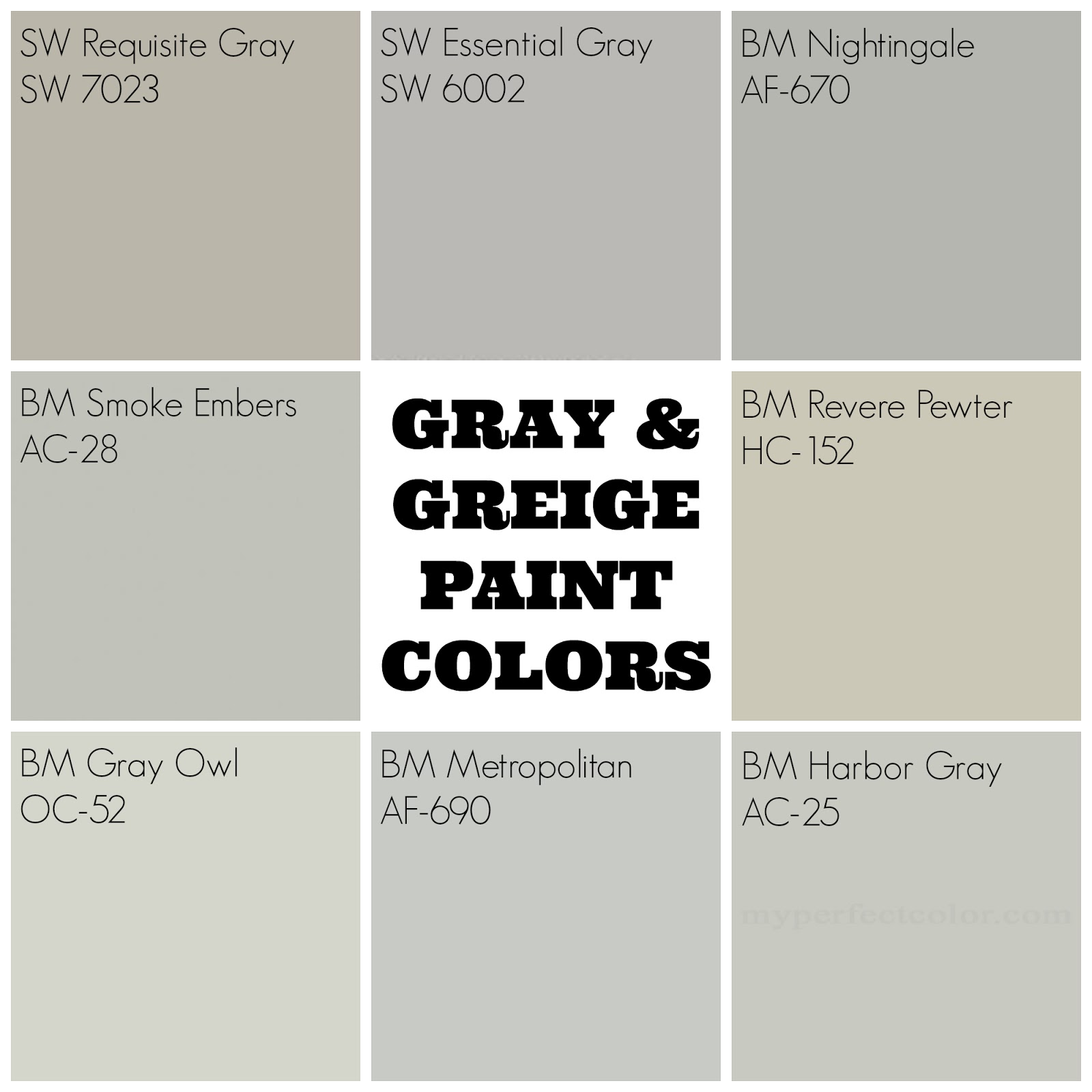
And just to make it even more confusing, here are the colors from the company's websites:
I feel like, with the exception of RP and RG being obviously more beige than gray, the rest of the colors look pretty darn similar. But on the wall? They all look completely different. Like, where did Nightingale's purple twinge come from? I don't see that in the sample picture at all.
As I'd suspected, Revere Pewter was too tan for my tastes. I liked Gray Owl but thought it was a little too light. Metropolitan was a little to dark and a little too blue in some lights. Harbor Gray was a clooooooooose contendor. It was really between Harbor Gray and Smoke Embers. Smoke Embers was just a smidge warmer and a smidge darker. I was pretty sure that Smoke Embers was the final choice, so I went to paint larger swatches of just that color to look at, only this time without the white background because I was too lazy.
Wait. What's that?
Those are the exact same color. I even took a close up pic of each one to see if it was the paint underneath bleeding through, or if just having white paint adjacent to the left sample was making all the difference.
And boom, I could barely tell the difference.
WHAT THE FRESH HELL.
Having a border of white paint totally changed the way my eyes were interpreting the color.
Thanks to this, I had (have) no idea what it's going to look like on the walls. While I know it will be the same color technically, is it going to actually look more like the warm/brown-y gray on the left? Or more cool and blue like the right? We'll have white trim, so maybe more like the left? But it will have much wider amounts of coverage, without every area having white adjacent to it. So maybe more like the right?
WHO KNOWS.
I certainly don't.
I actually still don't and still am not 100% sure on the color. I even went so far as to buy the paint, only to turn around the next morning and list it on a local BST page. I figured if I got offers for the paint, then it'd be a sign to go with Harbor Gray, and if I got no hits, it'd be a sign to go with Smoke Embers.
It's been up 24 hours and no offers, so....Smoke Embers it is? I think? I THINK!?!?
Hopefully by the next paint post, there will be actual paint on the walls (right now we just have the trim done) and we'll know if I choose wisely. Or poorly and I hate the walls and have to spend another 100 hours and $100 to repaint.


The paint will be beautiful. Your home will be filled with kids, and family, and stuff and all your hard work will be worth it. Hang in there - I so-o-o-o can't wait to visit :-) Love you all!
ReplyDeleteAt Image Line Painting, we provide you with a variety of pieces of Painting professional services excellent for both new areas and renovations. Sensitive surfaces, Image Line Painting able to aid in that, if you’re just now creating and are searching for professionals to expertly fresh paint your new
ReplyDeleteHello,
ReplyDeleteWe are currently going through this same process with the same lovely oak color. Could you please share what color you ended up choosing and pics?
Thank you!